It is human nature to be curious about where you stand in relation to others. For example, organizations can be competitive and thus interested in making comparisons between their organization and others in their shared market segment. People also want to be individuals and stand out in a crowd (even at the risk of appearing vain). But no one wants to be the last one in their school to catch on to a fashion trend (especially just in time for that fad to go out of style the next month). Even so, there are still those among us who are the last hold-outs re-iterating the virtues of Myspace over Facebook.
As new technology is developed, it takes time before the population acquires the new products utilizing that technology. For example, we can draw analogies between adoption of high-definition television and the adoption of IPv6. For high-definition TVs to become ubiquitous, the industry needed to have high-definition content for consumers to watch; the satellite, RF, and cable networks needed to be upgraded; and the cost of flat-panel high-def TVs needed to drop to an affordable level. Similarly, IPv6 needed to be implemented by the large content providers, service providers needed to build IPv6 backbones, and IPv6 needed to be integrated into all mobile devices and computer operating systems. In both situations, there could have easily been a “log jam” whereby none of the three (content, transport, or end-system) would upgrade. With high-definition TVs, the better picture was the draw for consumers. With IPv6, the increased address space and elimination of NAT are compelling reasons to deploy the protocol.
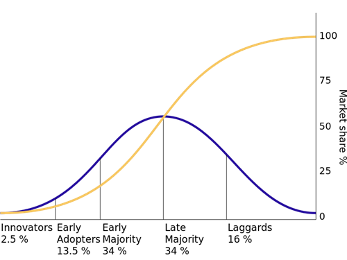
We have all seen those charts that compare the adoption of the telephone as well as households with televisions to the pace we now adopt technologies such as smartphones or tablets. There are many statistical models that describe the adoption lifecycle of technology. However, these modern innovations are demonstrating that technology adoption can occur faster than ever before. The familiar normal distribution “bell curve” doesn’t keep up with some modern Internet innovations that benefit from the “network effect”. Many of these technology trends do follow the Everett Rogers bell curve where the chart is divided into five categories. Below is a picture of Roger’s “diffusion of innovations.” The graph shows that there is a small population of innovators who are more aggressive about technology adoption and whose organizations possess more resources and are less risk-averse. Nest, there are those early adopters who are educated about the benefits of adoption and are open to new ideas and willing to experiment and “take a chance.” Then there are those in the majority who follow the trends and are more conservative. Finally, there are technology laggards who are skeptics and only eventually adopt technology after it has become a de-facto standard.
 Source: Wikipedia, https://en.wikipedia.org/wiki/Diffusion_of_innovations
The yellow line of this graph represents the “cumulative distribution” amount representing the total percentage of the population that has consumed the product, service, or technology. There are also derivatives of this graph that show “The Chasm” between the technology enthusiasts and visionaries and the early adopters and pragmatists. (This concept is covered fully in the book titled “Crossing the Chasm” by Geoffrey Moore.)
Our teenage son wears this ThinkGeek t-shirt that has a bell-shaped curve with some lines (possibly standard deviation marks). When I look at it I can’t quite tell what it means. On one hand, it could be a slight – intending to make me feel like I am at the low end of the intelligence curve or my class grade is woefully below average. On the other hand, it could represent that I should feel good about myself because I am one of the early adopters of an evolutionary technology. The latter explanation better suits my optimistic outlook!
 Source: https://it.pinterest.com/pin/178455203956549313
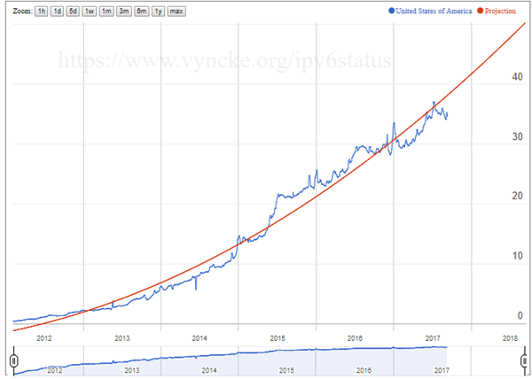
When it comes to IPv6, there are many graphs that we can look at to observe adoption of this Internet Protocol. One of the most popular IPv6 adoption graphs can be found on the Google IPv6 Statistics Page. Another graph is one produced by my friend and co-author Eric Vyncke that shows “Projection of IPv6 %-age of IPv6-Enabled Web Browsers (courtesy Google) in United States of America.” This graph also extrapolates from the available data a graph predicting that IPv6 adoption will continue on its upward trajectory.
 Source: https://www.vyncke.org/ipv6status/project.php
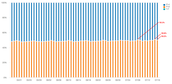
There have also been graphs created that attempt to predict when IPv6 adoption will surpass IPv4. One of these can be found in a presentation by Martin Gysi from Swisscom and one was shown in my article titled “IPv6 is Accelerating as IPv4 is Nearing its Peak.” Because IPv6 adoption is doubling every year, there is evidence to suggest that we will soon be reaching the 50% cross-over mark, where IPv6 is dominant and IPv4 becomes the legacy address protocol. There is now documented evidence that this is occurring in some specific places on the Internet. Recently, LinkedIn passed a significant milestone where their IPv6 traffic crossed this critical 50% milestone. Franck Martin of LinkedIn wrote an article titled “LinkedIn Passes IPv6 Milestone”, that showed a graph of the percentage of page views over IPv6 for LinkedIn over the last two months.
 Source: https://engineering.linkedin.com/blog/2017/07/linkedin-passes-ipv6-milestone
With all these graphs in mind, a new graph can be drawn that combines these three concepts. The following diagram superimposes the sine-wave adoption curve behind the Google IPv6 statistics graph with a graph that shows the phases of “diffusion” of IPv6 technology into the market. From this graph, we can see that the early innovators deployed IPv6 between 2000 and 2013. These include universities and research organizations, ISPs, mobile operators, and the large content providers. It appears that we have also passed through the phase where early adopters are now using IPv6. This population could represent large companies, or some government departments and agencies. We are now starting to get into the early majority phase of IPv6 adoption. However, from the sine curve, this phase may have a short duration because IPv6 adoption is doubling every year. It will be many years before the laggards get IPv6, or they may unintentionally start to use IPv6 because it is automatically built into their devices and the services they use.

IPv6 evangelists may not be the best futurologists in terms of accurately predicting when IPv6 will achieve mass adoption. For instance, back in 2000, I was convinced that IPv6 would be ubiquitously deployed by 2010. Today, we have some data collected about actual IPv6 adoption and we are more realistic about its inevitable and eventual adoption.
Your conclusions about this IPv6 adoption graph are likely to be similar to the way that I look at my son’s t-shirt. If your organization has already deployed IPv6 then you should feel proud about your aggressive pursuit of technological superiority. If you are just now planning your IPv6 deployment, then you are firmly in the middle-section of the bell curve graph. However, if your organization has not yet even seriously contemplated IPv6 planning and the eventual deployment, then you are going to end up in the late majority category. If you are still an IPv6 skeptic and sailing down the river of de-Nile (unlikely you would be reading this article in that case) you are highly likely to be in the laggard category.
Hopefully, you see the glass as half-full and realize that there is still time to help your organization get a jump on IPv6 deployment, join the early majority, and thus gain a competitive advantage by achieving dual-protocol Internet connectivity. Alternatively, you may elect to skip the dual-protocol phase and aggressively strive to deploy IPv6-only environments in your enterprise.
This post originally appeared on Infoblox community: https://community.infoblox.com/t5/IPv6-CoE-Blog/Where-Are-You-On-The-IPv6-Adoption-Curve/ba-p/11116
Scott Hogg is the Chief Technology Officer (CTO) for GTRI.
