

In the last post on this topic, my fellow Splunk architect, Micah Montgomery, gave an overview of one of the most important parts of getting going with Splunk: Getting Data In. He outlined a basic process and framework to follow when you need to successfully get data into Splunk so that you can make that data meaningful, actionable and useable. After all, without data, your Splunk instance will get bored and lonely.
In this post, I will pick up where Micah left off and talk about some of the ways you can very quickly get insight out of your data. If you’re just getting your feet wet with Splunk, or are looking to do so, I highly recommend the Splunk Search Tutorial that takes you from installation through creating reports and charts in a building block approach. The whole thing can be completed in a couple hours and will show you how quickly you can start getting value from data you already have access to today.
At this point I’ll assume you’ve got a working Splunk installation and understand the basics of getting data into Splunk. We will build on the use case and data sources Micah identified in his post: tracking failed logins to Cisco switches and routers. These activities are recorded in the switch/router syslog messages. For testing purposes, Micah discussed creating a syslog listener on your Splunk server that would allow the events to be indexed as they are generated. So what now? Well, let’s see how we go about looking into what we’ve got via Splunk’s built-in Search & Reporting App.
Oh the Wonderful Things Splunk Can Do: Searching, Alerts, Dashboards (and so much more)
As a system, network, or security administrator, you’ve likely had to review log files from various systems, devices and applications. If you’re fortunate (I mean really lucky), the logs are well formatted and use a human-friendly, readable format. For a multitude of reasons, that’s generally not the case. This is where the most basic of Splunk capabilities shines: searching data sources for specific terms and text patterns.
Do you know the specific format of a Cisco IOS log message for a failed login attempt? That makes two of us. No worries, Splunk makes this easy. I’ll start with a wild guess and try to find all login failures using the keywords “login” and “failed” or “failure”? Entering login fail* into the search bar will return all events that contain the word “login” and any word containing the stub “fail”. So what results were returned?
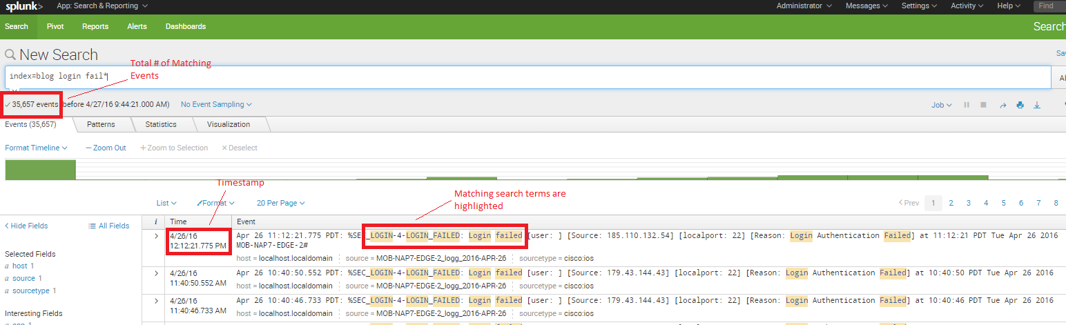
Splunk works its magic and immediately returns all of the event messages (from the device syslog message data source) that match the search terms. It displays the total number of events that matched the search term, it provides the syslog message timestamp, and highlights the individual search terms in each event that matched the search. Pretty slick.
In the screenshot above (click the image to enlarge), you can see that there is a piece of data in each matching event called “Source” followed by what appears to be an IP address and a port number. (I cheated and consulted the Cisco syslog message format reference documentation and will tell you that this represents the source IP address and TCP/UDP port number of the failed login attempt.) In the screenshot you can also see that two of the first three results are from the same IP address. I could modify the search to tell me exactly how many failed attempts are from this IP address. But Splunk makes it even easier – I simply mouse over and select the IP address (Splunk will highlight it in yellow), then I left-click and select “Add to search.” Voila! The search updates and I get just the events that represent failed logins from that single source IP address.
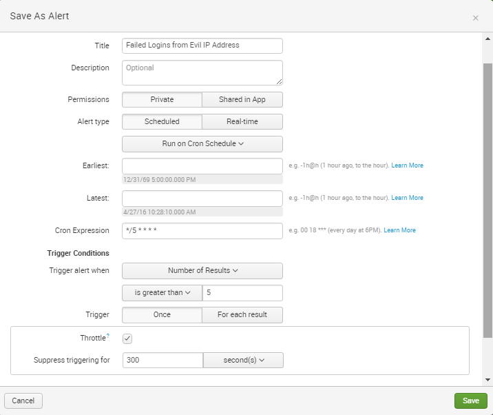
Let’s say I have determined that this IP address is from a nefarious entity and that I want to be alerted immediately if there are failed logins from this IP address. Yep, Splunk can do that. I simply select “Save As” from the upper right corner and choose “Alert.” A pop-up box allows me to populate fields as seen in the screenshot. In this case, I have chosen to use a cron scheduled task to run the search every five minutes. In other instances, using the built-in scheduling options of every hour/day/week may be sufficient.
The interface also allows me to choose an action to take when the specified condition is met. Email can be useful, but Splunk allows very advanced and customized actions to be taken ranging from scripted actions to posting information via third party application APIs. Your imagination is the limit. Many customers create an event in another system or generate a service desk ticket. GTRI even has a customer using Splunk to detect potential performance problems in their web application and having the resulting alert spin-up additional instances of the application to better service increased load.
So I’ve found some activities in the data that are potentially interesting. I’ve scheduled an alert to have Splunk continuously search the data for those activities and automatically notify me. In the real world, this is all very useful, but many of us have obligations to provide things like status updates and weekly reports. Splunk will help with that, too, and it’s easy to do with Splunk dashboards.
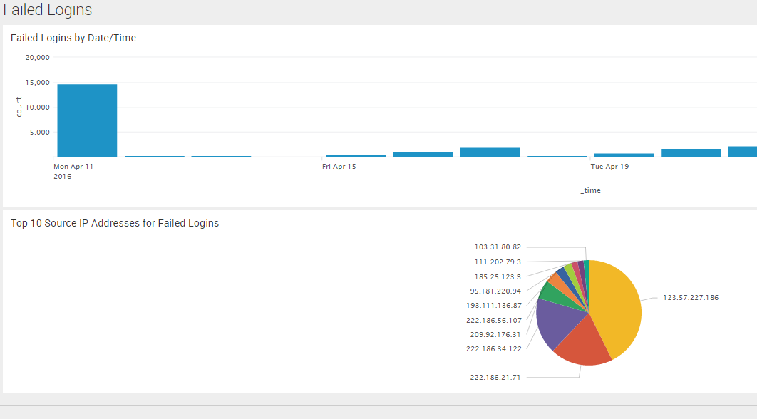
Below I’ll show you how to build a dashboard with two basic charts:
- The number of failed logins over time (a pretty graph)
- Top 10 IP addresses for failed logins (a beautiful pie chart)
Pretty graphs are well within Splunk’s wheelhouse. For this example, I’ll use the original search term (login fail*) and add the timechart count command. This tells Splunk to render a graphical chart that depicts the number of events over time, as shown below:
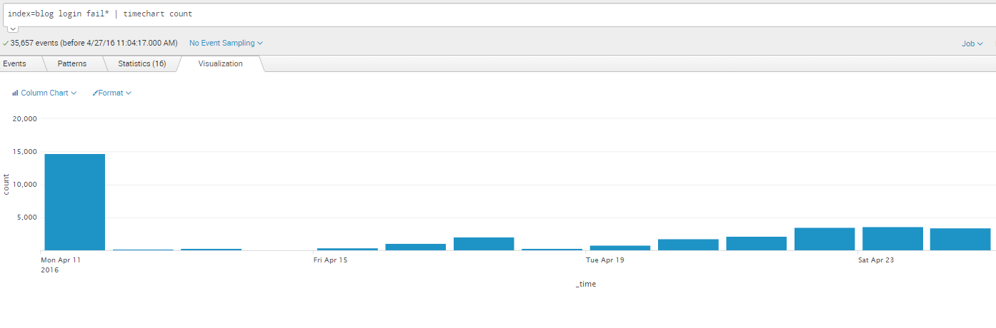
That was easy. It also looks good, which certainly helps. Adding this graph to a dashboard is easy via the “Save As” menu I used previously to create the Alert. This time I select “Dashboard Panel” and use the option to create a “New” dashboard as shown below.
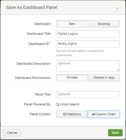
After I click the “Save” button I have the option to view the new dashboard. Since I’m going to add another graphic to my dashboard, I’ll simply close that box.
Building the second visualization, the pie chart showing the top 10 source IP addresses for failed logins, is just as easy. By using Splunk’s Interactive Field Extractor (IFX for short), I can quickly create a new data field within each event to represent the source IP address. This interpretation of the raw event messages occurs at search time via a concept called “schema on the fly.” This is a key differentiator for Splunk because it means I don’t need to have contextual knowledge about the format of our data beforehand to make use of it, as is the case with typical relational database platforms. (We will cover the IFX in greater detail in a future post, but if you’re unsure about how to make it work for you, the documentation here shows just how easy it is to use.) In this case, I’ve created a field called “src_ip” that represents the source IP address of the failed login attempt. Now when I re-run my search for “login fail*” Splunk automatically extracts the src_ip field.
Clicking on the new field within the list of “Interesting Fields” generates a tabular view of the top 10 values. The pop-up window also includes a link for a report called “Top Values.” By clicking on that, the search is updated to return a visualization of the top 20 source IP addresses.
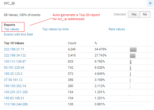
I can limit this view to just the top 10 by modifying the search term in the search box (changing the number 20 to the number 10). By default, Splunk renders a bar chart. To get a pie chart, I simply click on the drop-down arrow and select “Pie Chart.” And just like that, I’ve got my chart. I can add it to the existing dashboard similarly to what I did above, only this time I choose “Existing Dashboard” and choose the Failed Logins dashboard from the list. Clicking “View Dashboard” takes me to our new Failed Logins view of the data.
There’s an App for That
The example above is quick and straightforward. But like most things in our technology-driven, “smart” world, there’s an app that makes things even easier. In this case, Splunkbase, Splunk’s application repository for the Splunk Enterprise Platform, contains two pre-built apps for Cisco Networks. These two apps work in conjunction with each other. The Technology Add-On contains all the necessary configurations to make use of various Cisco device syslog event messages. The Cisco Networks App then renders these interpreted events visually in a number of useful, insightful dashboards with no further action required. The screenshot below shows some of the default data views that are available by simply installing these apps.
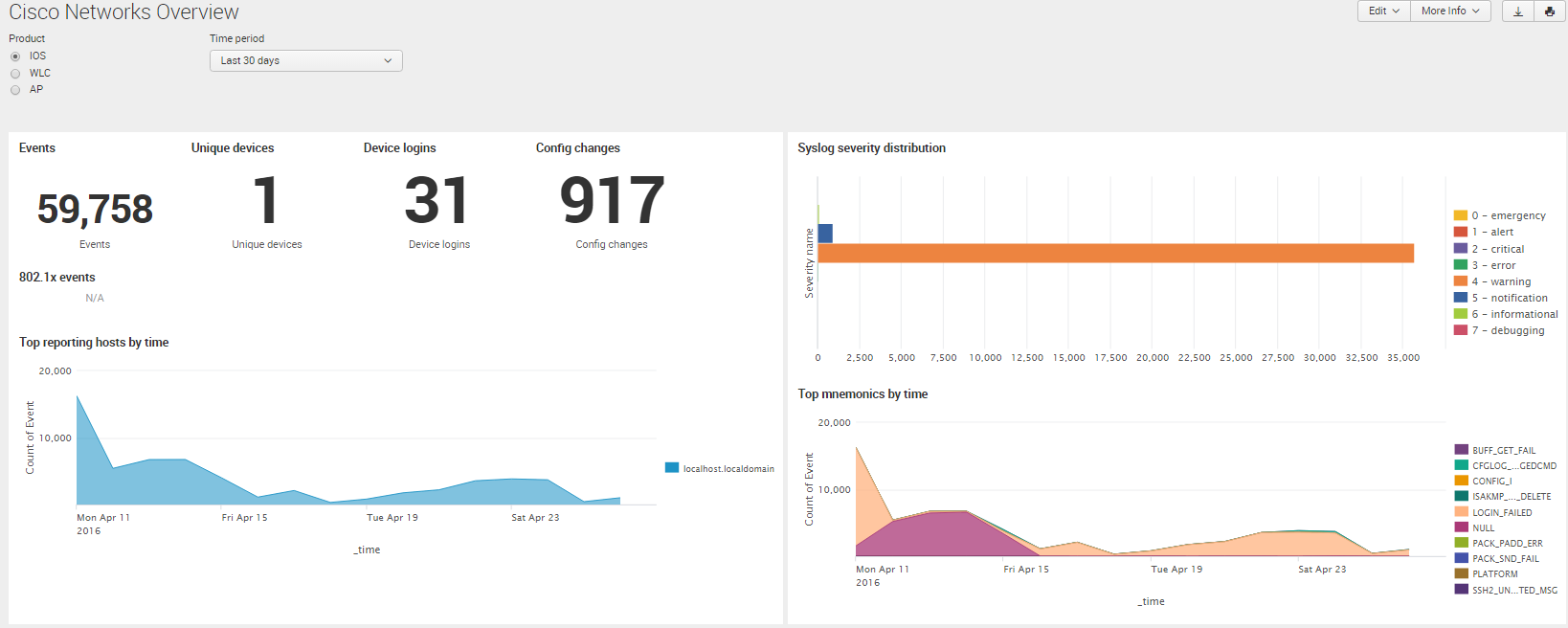
As you can see, this takes your game to a whole new level. That’s the power of Splunk Apps: they harness deep insight and technical details about a specific device type, application, IT service, or data set and make it readily and rapidly useable to you. Even better? With a few exceptions, these Splunk applications are available to use free of charge.
Now What?
Hopefully this simple example illustrates the potential insights that exist in data that at first glance may not seem all too interesting. Even more illustrative is how quickly Splunk makes these insights available to you. In future posts, we will highlight topics ranging from how to operate this example at scale (think thousands of devices) and how to correlate different data types together to tell a complete story about the health, function and performance of an IT service. As you will see, with Splunk, insight is everywhere you choose to look.
For more on how to use Splunk, attend one of GTRI’s online Splunk bootcamps.
Scott DeMoss is a Solution Architect for Data Center and Big Data in Professional Services at GTRI.